Template editor
The CoverKit template editor is the block editor screen for a coverkit template. Use it to design layouts that use cases and the Canvas block can reuse.
Opening the editor
Section titled “Opening the editor”- Go to Media → CoverKit (or CoverKit in the admin menu).
- Click Add New or open an existing template.
- Publish or update the template when you are done so assignments and cache stay in sync.
CoverKit sidebar
Section titled “CoverKit sidebar”The CoverKit plugin sidebar (gear icon) groups:
- Template settings — canvas width, height, background, and gradient (these are the template’s canvas, not a separate Canvas block).
- Use cases — enable outputs, adjust per–use-case settings, and map fields to layers. See Configure use cases.
There is no separate CoverKit settings screen for use cases; everything lives on the template.
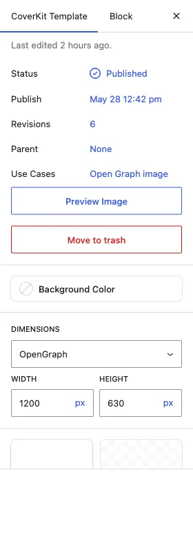
The CoverKit Template document tab summarizes the template: status, publish date, revisions, parent, the assigned use cases, and a Preview Image action.
Canvas and zoom
Section titled “Canvas and zoom”- Canvas size is edited in the sidebar or via canvas controls tied to the template.
- The infobar at the bottom of the screen offers zoom and canvas tools while you work.
- The status area shows contextual information about the current template.
If a use case recommends dimensions (for example 1200×630 for social link previews) and your canvas proportions differ, the use case panel may warn you and offer Match aspect ratio so the canvas proportions match the output crop without changing your working scale.
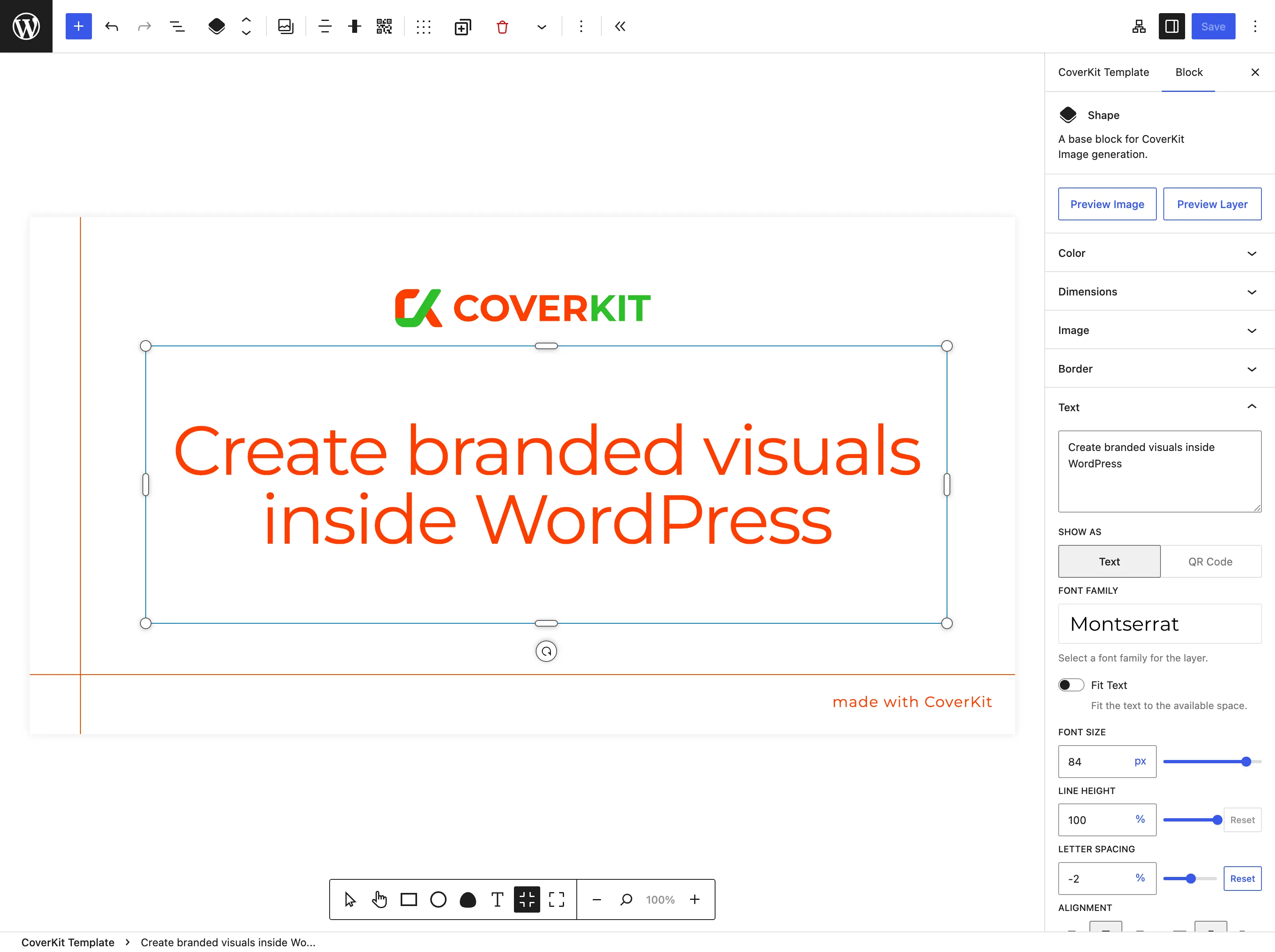
Layers
Section titled “Layers”Templates are built from Layer blocks—each layer is one element in the generated image.
Adding layers
- Use Draw Layer (or equivalent toolbar actions) to add text, images, rectangles, circles, or other supported layer types.
- Drag layers on the canvas; use list view or layer controls to change stacking order (which layer appears in front).
Layer types (inspector varies by type):
- Text — fonts (Google, theme fonts, or TTF/OTF uploads via the Font Family picker), fit-to-box, optional
{field_name}placeholders in static text. Uploaded fonts are stored inwp-content/uploads/fonts/coverkit/. - Images — media library or dynamic sources when mapped
- Basic shapes — rectangles, circles, polygons where supported
- Screenshots and QR codes when available in the inspector
Field mapping for use cases is configured in the use case sidebar, not by typing field IDs into layer names. See How to configure use cases.
Preview
Section titled “Preview”- Use Cases sidebar — while you edit mappings or settings, CoverKit loads a live preview image for the selected use case (for example Open Graph or Sandbox). Updates are debounced as you change the template.
- Templates list — the Preview column shows a cached thumbnail via
GET /template/{id}/preview.png(post_id= 0). Click the thumbnail to open a larger image with a fresh render. - Layer preview — when inspecting a layer, an in-editor preview can reflect the current layer content.
If any preview looks stale after design changes, clear the template cache.
What is not in the template editor
Section titled “What is not in the template editor”- Insert from Template — that control belongs to the CoverKit Canvas block in posts and pages, where you pull an existing template’s layers into a canvas instance.
- coverkit/canvas as a root block — on templates, the “canvas” is the template itself; dimensions live in template settings.